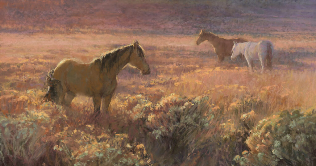
Snownado! How to Paint Snow in Pastel
A Pastel Demonstration That Will Make You Pine for the Next Winter White Out
It’s the season of snow flakes and slush, flurries and icicles. How to evoke the crisp, clean look and feel in your next painting? This pastel demonstration from Liz Haywood-Sullivan details just what to do, including the hardest trick to pull off — getting your color values right.
After you explore Liz’s winter wonderland, be sure to get the resource that will allow you to make your own right now. Our Landscape Painting in Pastel Winter Mood Streaming Video is just a click away–instant access as soon as you check out.
Painting the Pastel Landscape in Winter
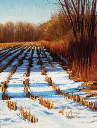
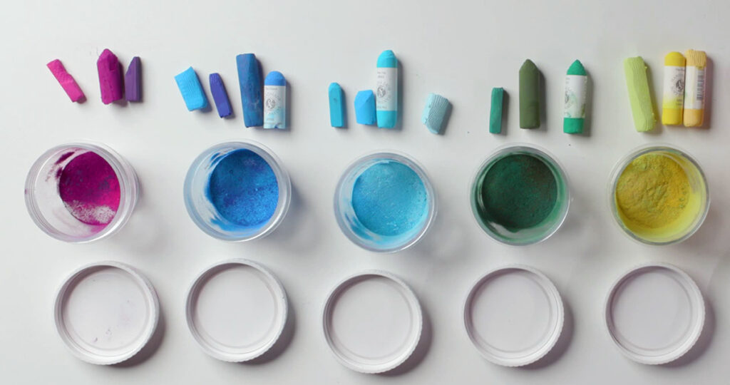
For The Depth of Winter, Liz used a variety of pastels: Girault Terry Ludwig Diane Townsend Unison Henri Roché For her surface: UART 500-grade sanded paper, mounted on Gatorboard Surface Tip: Work on black Canson Mi-Teintes paper or a sanded paper, such as UART or Wallis, underpainted with a color that will work as the shadow under the snow. Using one of these bases allows you to lay the snow—the light—on top. Mark-making Tip: Make sure your pastel strokes follow the lay of the land, moving horizontally over the ground, so that you are placing the snow by replicating the way it actually falls.
1. Map Your Drawing
I used a Girault pastel dark enough to see but not so dark as to interfere with the lightest values I’d be using in the painting.

To scale up my image from the reference photo, I marked off my paper into four quadrants, rather than thirds. I did make sure, however, to place my primary shapes and focal point using the Rule of Thirds. For example, the edge where the field meets the background trees is one-third the height of the painting. From there, I used a simple line drawing to indicate just the major shapes.
2. Add Pastel for Underpainting
Because the pastel I added at this stage would be washed down with alcohol, my selection of colors was based on what color I wanted the paper to be “stained”—the colors I wanted to peep through the final layers of pastel.

I generally chose warm colors that would lend a unifying effect to the finish. For instance, I placed purple in the sky, knowing that the specks poking through the final would connect the sky to the same purples in the brush.
3. Apply Alcohol Wash
I use a 1/2-inch flat, synthetic brush and alcohol to wash down the pastel, working from lightest areas to darkest, and trying to preserve each color area.

I blot the brush often to prevent drips. The alcohol “sets” the underpainting color so that, when dry, I can run my hand over it and the pastel won’t lift off. I let this dry completely before moving on.
4. Establish a Value Road Map
Next, I examine my painting for the extremes in color value. On a bright sunny day, the values will be further apart. I locate the darkest dark on the tree trunks on the right and along the corn rows where there’s deep shadow. I place some bright snow patches as the lightest light, then dropped some light value on the sky. The sky isn’t the lightest area, but if you don’t correctly establish the sky value at the start, it can throw off value choices throughout the course of painting. Whereas, if correctly established in the beginning, these values act as a road map for subsequent value choices.

I establish the extremes of the scene in the soft undertones. In this case, the trees were the darkest dark, the sky was the lightest light, and the edge between them the most dynamic area. The most intense color was in the sunlit grasses.
5. Establish Colors and Values
In this stage, I start to develop the vocabulary of color and value. Using the side of my pastels for broader strokes, I move over the entire piece to establish larger shapes of correct color and value: the sunlit cornrows at the horizon, the shapes and colors of the hedgerow and trees in the center right, and the forms of snow in the foreground.

This is a good time to recheck a composition. For instance, my focal point — where the cornrows and hedgerow converge on the horizon line — was too close to the center, so I decided to add some more hedgerow in the distance to guide the focal point over a bit to the left.
6. First Finished Marks
At this point, it seemed like my painting had developed a bit of a split personality. Having established colors and values over the entire painting, I knew I could start to move toward the finished marks in the background, laying down a solid base for the next layer of marks that progress closer and closer to where I was standing. At the same time as I finished areas in the distant treeline, however, there remained a lot of untouched areas in the foreground. I wanted to preserve the underpainting in these areas as shadow areas in the snow and wasn’t yet ready to place those strokes.

Like the sky, which gets paler closer to the horizon, the snow that’s in shadow (not directly lit by the sun) reflects a darker blue closer to the foreground and gets slightly paler as it recedes into background. I painted a darker underpainting in this area where I intended the brighter blue to lay on top. To blend the bare trees into the sky, I drew more sky color down into the branches. Because the upper branches become silhouetted by the light sky, you don’t need as dark a color to make the upper branches visible. So, I chose a lighter value for the upper branches than for the lower.
7. Tie It All Together
Moving from the background forward, I start to finish areas. The cornrows in the back were lightened and indicated with smaller lines. I made the line work more defined, bolder and robust in the foreground. Then I refine the snow in between rows, taking care to blend the change in the blues from lighter to darker toward the foreground.

I kept the closest edge of the shadow area slightly lighter where it catches light from the bright snow in front of it. Some of the cornrows in front were drawn in, showing where the sunlight is catching them. To tie a painting together, I like to find one or two colors that work throughout the piece. In this case, I used a mid-range red ochre in the far hedge row, across the horizon line. I then used the same color on the cornrows in the shadow and most prominently at the right edge of the field, before the hedge, where the horizontal strokes over the dark underpainting indicate grasses lying flat over a raised bump.
8. A Few Last Corrections
Now came the time to finally address the shadows running across the field. Because I was working from a photo, I’d been painting the shadow strips with the distortion from the camera lens. They were angled too much; the perspective didn’t look right. I take my piece outside and, using a stiff brush, wipe out the entire area.

From this point forward, I no longer reference the photo. I remembered being in this field in the snow, and I use my memory to paint. Troubleshooting, I reduce the large shadow area slightly and flattened the foremost edge, which set the shadowed field back in the distance. I also thin and flatten the two shadow bands at the bottom. By making these corrections, I am able to create more of a sense of distance and mitigate that “painted from a photo” appearance.
9. On to the Finish
From here, it is just bits and pieces to finish. I place just a few spots of light on the tree trunks to the right. Then, using some light to reddish browns, I draw multiple thin branches around and over the tree trunks and into the sky.

I use Henri Roche yellow ochre on the tall, dried grasses at the bottom right. This color was the perfect choice to touch up the cornstalks as well. To bring energy to the snow in the foreground, I use large strokes of the Ludwig pastels, which are buttery soft. I also use a light-blue Girault pastel to lightly draw lines indicating tractor tracks, which help support the perspective. And then came the hardest part — deciding it was time to stop.
Have a technical question?
Contact UsJoin the Conversation!