Using Warm and Cool Colors in an Abstract Landscape Painting
Uniting gestural abstraction and calligraphic mark making, Frank Satogata celebrates nature’s beautiful juxtapositions. Here, he demonstrates using warm and cool alterations in one of his abstract landscape paintings, featured in the June 2012 issue of The Artist’s Magazine.

1. Looking at the Photo
A blurred photo, shot from the window of a moving car, was the inspiration. My intent is always to capture the essence, so a blurred photo allows me to focus on the broad shapes, not the details.
.

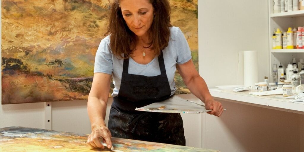
2. Base Undercoat
I made broad, loose strokes with acryllc and oil pastels with just a suggestion of the fir trees dividing the sky and foreground. The colors are warm here, the complement of what the colors will be on the second layer.
.

3. Overcoat
Still keeping everything loose, I added cool, opaque colors to contrast with the warm colors of the first layer. I then scraped away part of the first layer to reveal the warm colors below.
.

4. Tonal Contrasts
I added more colors to enhance the tonal contrasts and to further define the shapes of trees. Again, I scraped as well as added. The process is both additive and subtractive.
.

5. Working on the Computer
I selected a portion of the original 12×12-inch image and scanned it into Photoshop to create a vertical scroll-like image. I added a horizon line by shifting the upper two thirds of the painting to a cooler palette.
.

6. Adding a Cool Layer
For the second, digital layer of the scroll, I duplicated the original image and selected areas to be erased so the first layer could show through in places. I shifted the remaining sequences to a cooler palette.
.

7. Adding a Warm Layer
I again duplicated the original image and erased selected areas so parts of the first and second digital layers could show through. I shifted the remaining parts to a warmer palette to unify (and complicate) the composition.
.
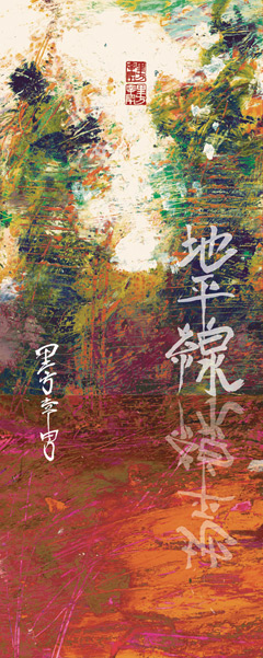
8. Adding Calligraphic Layer
After I balanced the color, tone and shapes, I added the calligraphic strokes for chiheisen (horizon) and its muted reflection beneath it and then my name in a kanji (pictogram), plus a chop stamp, in Chiheisen II (dye sublimation print on aluminum, 40×16).
Read the full feature article about Frank Satogata and his abstract landscape paintings in the June 2012 issue of The Artist’s Magazine. Visit his website at www.franksatogata.com.

Free artistsnetwork.tv preview
Watch a preview of the video “Vivid Color Landscapes: M. Katherine Hurley Paints Pastels.”
.
.
MORE RESOURCES FOR ARTISTS
• Watch art workshops on demand at ArtistsNetwork.TV
• Get unlimited access to over 100 art instruction ebooks
• Online seminars for fine artists
• Learn how to paint & how to draw with downloads, books, videos & more from North Light Shop
• Subscribe to The Artist’s Magazine
• Sign up for your Artist’s Network email newsletter & download a FREE issue of The Artist’s Magazine

Have a technical question?
Contact UsJoin the Conversation!