What do you mean by the value scale of the landscape?
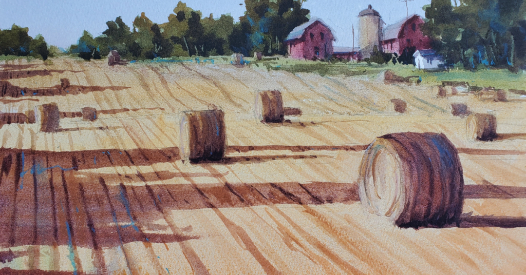
A numbering system is often attached to this scale, facilitating the ability to reference values in our notes. I’ve always used 0 for black and 10 for white. Other artists have reversed the numbering but I prefer 0 for black, as it represents the absence of light, and 10 for white representing 100 percent light; it just seems logical for my way of thinking. Using this scale we find that 5 is middle value. Since most of us were taught to use this scale, we bring its influence outdoors and relate it to what lies before us in the landscape. This will almost always produce darker paintings that are more kindred to the interior still life than the highly illuminated landscape. For this reason, I’ve encouraged students to represent the dark masses with value 3, moving the middle value from 5 to approximately value 6.5. Darker accents may be added later that fall below value 3.

By moving the scale up to a range of 3 to 10, and massing in the major values representing the dark, middle and light, I end up with a more illuminated painting that better communicates the natural light found in nature. The true job for us all is to see light accurately. By using a value scale, we might better see that light!
“Color is an inborn gift, but appreciation of value is merely training of the eye, which everyone ought to be able to acquire.” — John Singer Sargent


Finally – now I get it! This information is most helpful.
I never could figure out just exactly what was wrong, but
you have explained it away. Thank you so much. I’m enjoying
reading your articles and learning as I go. You’re a natural
born teacher and I’m looking forward to your next posting.
By the way, your work is breathtakingly beautiful – thanks
for sharing it.