Julio Reyes Paints Beauty in a Weary World
This feature article on Julio Reyes and his fine art portraits and figures first appeared in the May 2011 issue of The Artist’s Magazine.
Southern California artist Julio Reyes was once a contender of a different sort. His talents as a high school soccer player had brought recruiters calling with offers of scholarships. Reyes had played in championship games around the world, but on a team trip to France, while standing among his teammates in the galleries of the Louvre, Reyes had a revelation.
“As I looked around, I was overwhelmed with this tremendous sense of longing,” says Reyes. “It felt as though I was the only one who knew we were surrounded by splendor.” That same night he went to his sketchbook and drew all he could remember of the artworks. The intensity he’d reserved for soccer was quickly redirected to his new vocation.
Looking back, Reyes doesn’t regret this decision to leave a promising athletic career. Playing sports would have been a short-lived profession, but making art is something he can do for a lifetime, and it brings him a sense of catharsis and calm. Painting fine art portraits and figures is for him comparable to crafting poetry, and often a random sensation or impression urges him to create. “I’ll get some flash or notice some detail—the way the wind catches someone’s hair or the way light falls on a corduroy jacket. Then I’m hooked,” he says. “A strong work is the fruit of powerful experience and deep impressions. Every memory, sound and smell writes itself upon the heart.”
Weary Yet Sublime Portraits and Figures
Reyes describes his finished works as a “hodgepodge” or “reconciliation” of many drawings and paintings. He sometimes switches media as he explores the advantages of one over the other for a particular work. He loves the instantaneous quality of watercolor. Oil offers more weight and a variety of textures and finishes. When he begins a drawing, much of the heavy lifting is done by mechanical pencil accompanied by a great deal of restraint as he resists excitedly jumping in with flashy marks as opposed to working patiently through the layering process.
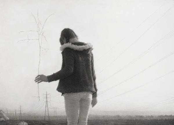
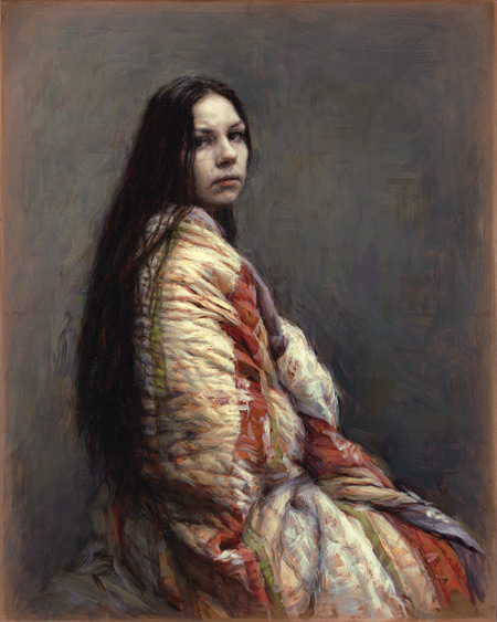
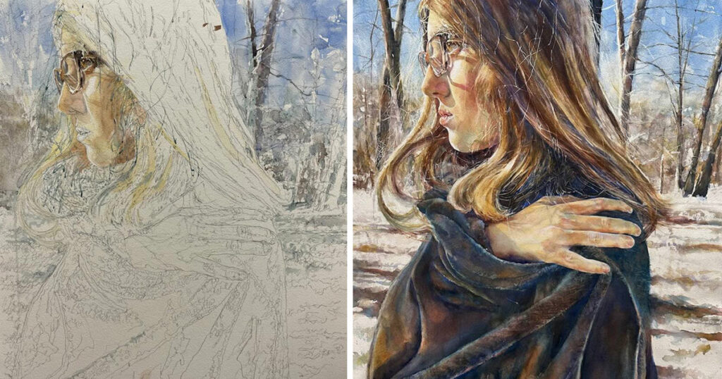
Many of Reyes’s works convey the feeling of longing he experienced at the Louvre. His wife, Candice Bohannon, also an artist, acts as model, often depicted as a lone figure before a desolate background. “Environments aren’t there to fill up space,” he says. They’re pregnant with meaning. They have as much, if not more, potential to communicate as a figure.” The vast, bleak grisaille landscapes evoke weltschmerz, or world weariness. Largely empty except for industrial remnants, the paintings chronicle humankind’s tendency to build and abandon.
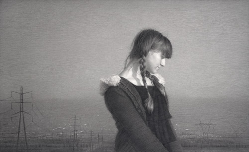
“There’s a hidden melancholy in our time—in some way linked to the cultural vacuum left in the wake of the postmodern ethos,” he says. “We live in a kind of new frontier where all old truths have been torn down and none replaced. That’s part of why I depict such things as electric towers, power lines and the arid landscapes the way I do—to juxtapose a very private moment against the immensity of a weary world.” In the sadness, though, there is a beauty that Reyes strives to convey—that which lends sublime moments to life.
Monochromatic Art and Subtle Color
One appealing and powerful feature in Reyes’s paintings is his subtle use of color in predominantly monochromatic artworks. “I stay away from drastic color mixes,” he explains. Bold color might distract from conveying a certain experience to the viewer, and Reyes isn’t one to hammer the viewer over the head.
But there’s another reason behind the muted color palette. In grade school, during a routine set of tests, Reyes discovered that he was partially colorblind. He finds it difficult to distinguish between red and green as well as blue and purple. “Phthalo greens and blues are tough for someone like me,” he says. While color may not be his strength, value and temperature are.
Regardless of this compensatory strength, how does he make do with such a challenge? With a lot of research—and reliance on other eyes, including those of his wife. Reyes points out the irony of her strong color sense and his color weakness. There have been times when he’s completed a portrait, only to be heartbroken when he learned that he’d painted a face green. Not one to give up easily, Reyes simply scraped the paint away and started again.
Running With the Masters
To prepare his mediums, Reyes lets linseed oil and walnut oil thicken in sunlight, sometimes up to a year, so they become “grabbier” on canvas. He discovered this do-it-yourself approach for making heat-bodied oils through the Art in the Making book series, published by the National Gallery of Art, London. He also builds his own easels, affixing the panels and stretcher bars by hand. (Click here to see Reyes’s step-by-step demonstration: How to Get Your Canvas Primed and Ready.)
-
The painting surface for Candice in Yellow 1 (oil,10×8) by Julio Reyes, is a hand-beveled copper plate prepared using archival techniques to achieve proper paint adhesion. ” I carefully sanded the plate, cleaned it and then rubbed it with garlic,” says Reyes. “This allowed for the subsequent paint layers to bond, both mechanically and chemically to the plate. When properly supported and mounted, paintings on copper plate can be more prmanent than paintings on canvas or wooden panels.”
While his training is academic and he employs certain historical techniques, Reyes disdains paintings that follow the old masters to a fault. He feels that without taking from one’s own experience, a painter is really speaking with an affected accent—a “borrowed visual language.” He explains, “If your experience has been a deep one, a new language is born of it.”
The above portion of the article is by Lisa Wurster. Following is a short fine art portrait demonstration by Julio Reyes.
The Making of an Empire
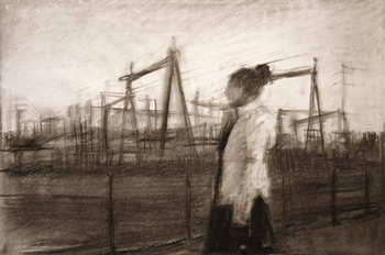
1. Before painting Empire, I created a 9×12 charcoal study (above). Charcoal allowed me to describe boldly and quickly the basic shapes of light and dark masses—formal qualities I value most in the heat of things when the idea strikes and I’m trying to get it down. I was struck by the white shape of the jacket against the dark mass of the towers and power lines, as well as the complexity of the pattern that dark mass cast on the horizon. With charcoal, I was able to draw out that vital juxtaposition, both conceptually and pictorially.
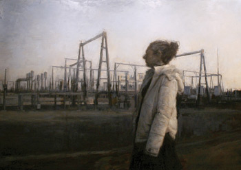
The underpainting (above) of Empire is what I call a dead-color stage. The forms are roughly blocked in with neutral colors, and the lightest lights and darkest darks are still close to the middle of the value scale. But every painting is different. Sometimes I’ll start with strong, almost extreme local colors and sometimes with just a grisaille. I chose a neutral block-in with Empire because I knew I’d be dealing with a limited palette in the finished piece. From this stage, completing the painting was a matter of refining forms, strengthening values and enriching the color.
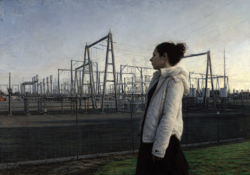
Everything in Empire (above), from electric towers to chain link fence to that marvelous jacket—was painted with fidelity to the way the light of the aftergow illuminated the actual objects. Much of the varied richness comes from positioning bold alla prima passages alongside subtle, layered passages.
LEARN MORE
- See a free preview of Costa Vavagiakis digital workshop “Drawing a Portrait from Life.”
- Check out the downloadable e-magazine “How to Draw People: Portrait Drawing in Graphite and Charcoal.”
- Read the online article “How David Jon Kassan Paints Oil Portraits.
- See a free preview of the Artists Daily DVD workshop Mastering Portrait Drawing with Susan Lyon.
- Read Candace Bohannon’s step-by-step demonstration, “How to Paint Flowers in a Still Life Oil Painting.
MORE RESOURCES FOR ARTISTS
- Watch art workshops on demand at ArtistsNetwork.TV.
- Get unlimited access to over 100 art instruction ebooks.
- Online seminars for fine artists
- Learn how to paint and how to draw with downloads, books, videos, & more from North Light Shop.
- Subscribe to The Artist’s Magazine.
- Sign up for your Artist’s Network email newsletter & download a FREE issue of The Artist’s Magazine.

Have a technical question?
Contact UsJoin the Conversation!