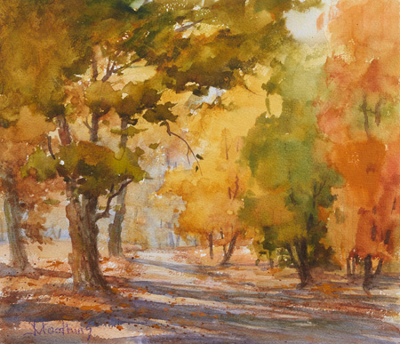
Painting the Landscape: 11 Questions Answered by Johannes Vloothuis

Landscape Artist Teaches Thousands & Shares His Tips with Us
With landscape artist Johannes Vloothuis guiding the way, thousands of artists from around the world learn how to paint. His teaching methods are geared toward those who are new to landscape painting (maybe you or someone you know) and to those who are experienced. Starting as a mentor on WetCanvas.com, he now has instructional video workshops and teaches online workshops here on Artists Network.
To pay homage to his beginning endeavors, here are 11 questions (from Johannes’s own students!) answered by the landscape artist himself, dealing with all walks of painting life, from color to composition and reference photography. Enjoy!
Courtney
***
On Color, Cloning and Photoshop
Q: Is there ever an appropriate time to use “cloning” or repetition in a landscape painting?
Repetition creates rhythm, which is good, but there should be variances in these repetitions–not cloned repetitions. For example, if we have a deep forest scene and we see several long vertical tree trunks, we should vary their diameters, colors, angle, and the distances between them. The repetition of these vertical movements creates a rhythm, but the tree trunks should run parallel to one another.
Q: Should we modify a reference photo with Photoshop filters?
We should use as many tools as possible to end up with the best end result. What counts is the final artwork, not how you got there. I believe there’s no such thing as cheating in this.
Q: Do you suggest pushing colors to make a painting more interesting?
If we listen to nature and its sounds–such as a crashing wave, the roar of wind, or the birds singing, we realize that all this is beautiful. However, we humans want more and we want to express ourselves and communicate with each other. We create songs that are more beautiful than nature, don’t we? Think of your painting like that. It’s a personal poetical message. Color, just like musical instruments, is our tool to convey this wonderful message. Nature produces many dull monochromatic colors. If we add more flavor to this, it will be like hearing a crashing wave in the background while listening to instrumental music.
Out and In, Light and Dark, and Clouds
Q. Does a good painting look better when you stand back from it than up very close?
For your final outcome, keep in mind that paintings are normally viewed from 5 to 10 feet away. Some artists joke that they wish they could attach their brush to a broomstick to get the right view. Some instructors place a chair between their students and their easel.
Q: Do you need to show the lights and darks in a landscape, including the trees?
Many top artists are leaning more toward an overall mid-value. I’m following this as well and I feel my paintings improved dramatically when this was revealed to me.

Q. A lot of photos contain few clouds… do you like to add clouds? Or, when should you add clouds?
The rule of thumb for me is that if the sky portion is small we leave clouds out so it won’t get busy. The bigger you make the sky, the more interest you need to add. The only thing we can do to make a sky interesting is to add clouds or different colors. However this isn’t because of what’s in the photo; it’s because I want it that way in the painting. The photo is not my boss. On an 18×24 inch painting, for example, if you have more than 4 square inches of nothingness, you’ve created a dead spot.
Q: Could a strong skyscape have three planes of clouds within the sky and the sliver of land as foreground?
Yes, great question. The sky is a dome and as such would have a recession into the distance. The following principles apply:
• The fluffy white part of any cloud gets warmer as it goes further back. In the painting that would be near the horizon.
• The reverse is true regarding the shadowy blue-gray areas of the clouds. They get lighter and cooler into the distance.
• The blue sky (not considering the fluffy white clouds) is darker and cooler at the zenith and this blue sky becomes warmer and lighter (more greenish, pink or orange) as it gets closer to the horizon.
• Finally, due to perspective, clouds get smaller near the horizon and bigger at the zenith.
Q: I can easily distinguish values when in black and white but have difficulties with color. Is creating underpaintings the secret to learning this?
That’s a fantastic question. We all have problems determining what value a color is because the chroma throws us off. That’s why most artists think in six values but plan their masses into three predominant values. An underpainting in the correct grayscale value (usually a warm brown) is an excellent way to start with a good value plan.
Photos, Details and Cropping
Q: Do you collect photos so when you’re working on a piece and need to add an element, you have something to go to?
Yes! I have a hobby called shape collecting and use a landscape model agency. I have trees, rocks, bridges, and more subjects as super models.
Q. Since things that are closest show the sharpest detail, is it okay to put sharp detail at the bottom of the painting?
No; sharp detail belongs where the eye is focusing. Do the test yourself. Hold two pens, one in each hand. Stretch your arm out as far as you can holding one pen and bring the other pen closer to you. Stare at the pen that is farther from you without moving your eyes. See if you can see the detail of the pen closer to you. It’s a revelation–to make the painting agree with the human eye–and this concept is rarely taught. I actually emphasize that the immediate foreground should be left alone.
Q: I would like to know what you do with things that are cut off by the picture’s edge, like a bush or tree.
My policy is to crop the tree by either one- or two-thirds; never in the middle.
And there you have it–I hope that you’ve found inspiration or knowledge from these pieces of advice.


Thank you for sharing your wisdom.
Thanx Johannes for your Q & A. As always, I learned a lot. Even when you write, you communicate in visual language, so I could/can SEE what you are saying. Also, you answered each question concisely, to the point, which I have also appreciated about your instruction through the years. Hope you continue teaching & sharing your vast, accumulated store of knowledge & experience for a long, long time. Many years a student of yours, I remain, E.K. Welch