Painting | How to Use Reflected Light
Subtleties of Light
Lovely and elusive, reflected light adds life and dimension to your painting.
By Jane Jones
Light that you see shining on an object is of two types, direct and indirect. The direct light is usually the lightest area of an object. The indirect light—which I’ll refer to as reflected light—is that which bounces off other objects in the same area.
The easiest place to see reflected light is near the shadow areas of an object. This light can create a beautiful glow in an area opposite the light source—a glow which separates an object from the surrounding dark area, emphasizing the illusion of form. Reflected light tells the viewer that the object doesn’t just stop at the shadow but rolls around to the back, adding dimension. Compositionally, reflected light can create a gorgeous bit of variance in an otherwise dark or uninteresting area, bringing it to life.

Look at the photograph of a sphere in sunlight (above). The highlight area directly in the path of the sunlight is the lightest because it’s in the direct light. On the left and lower areas of the sphere you see light of a darker value that’s reflected from the sphere’s surroundings. Direct light is always lighter in value than reflected light, so the value of reflected light should not compete in any way with the highlights or lights. On the other hand, reflected light is always lighter than the shadowed areas.
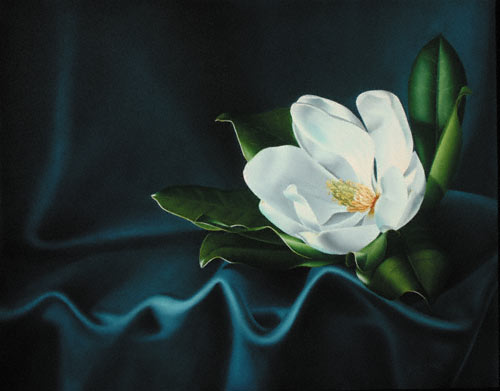
When you see a shadow, look right next to it for reflected light. Sometimes it’s as apparent as it is on the sphere, while other times the reflected light isn’t so obvious. My painting La Luna (at top) has many areas of reflected light—some readily apparent and some subtle. The main light source is to the upper left of the setup.

Drapery
In the background area on the far left side is an L-shape (A). The light within the L-shape can’t be from the main light source on the left, because the fabric billow blocks that source. The light in that area is reflected from the white flower. Compositionally, this reflected light leads the viewer’s eye right back to the focal area, which is the flower.
Notice how the sliver of reflected light in the fabric fold in the foreground (B) helps to separate that part of the drapery from the area behind it.
The lower right corner (C) is one of the least lit areas of the composition, so the reflected light there is darker than the other reflected lights. There’s just enough light to draw attention to that portion of the painting. This light also separates the drapery fold from the fabric behind it.

Magnolia
Always look near the shadow area of an object for the reflected light. The right side of petal D reflects the light from the petal next to it (E). In turn, petal E is reflecting light from the petal next to it.
The upper outside part of petal F is reflecting the shine from the leaf behind it. The light is white because the shine is so bright. The lower outside of petal G is reflecting the light from the petal below.
You might expect the inside cup of the flower to be darker than it appears in this painting. That would be the case if the flower itself were a darker color—like red. But the light inside the magnolia reflects all over and illuminates most of the petals. You can see this reflected light clearly near the tip of petal H.

Leaves
The intensity of reflected light changes as an object recedes from the light source. Leaf I is close to the flower, so the reflected light is very light, but not as bright as the shine of the leaves or the leaf highlights. The reflected light on leaf J is also quite light because of the leaf’s proximity to the flower.
Leaf K is farther away from the white flower, so the reflection on that leaf isn’t as bright as reflections in leaves I and J.
The right of leaf L is in dark shadow, yet it reflects a little light. This gives the dark shadowed area interest and illuminates the leaf’s texture. I painted this area lighter than I really wanted it to be, because I knew I would paint over it later with a glaze of dark green to really put the leaf into shadow.
The entire shadow area of leaf M is lightened with reflected light, so this shadow isn’t as dark as the shadow on leaf L.
The lower portion of leaf N also has just a bit of reflected light.
All the reflected light in this painting comes from the white flower. You can see how the light bounces around the entire composition, bringing all areas into harmony and shadows to life. Once you start looking for reflected light, you’ll see its beauty and compositional possibilities.
My palette
All paints used for La Luna (on page 74) are Winsor & Newton.
- Drapery: I used mixtures of phthalo turquoise, transparent yellow, titanium white and Gamblin napthol scarlet. For the glaze I used the same color mixtures, but without the white.
- Flower: Here I used the same colors as I did for the drapery, but mixed to be much grayer. Because white objects reflect the colors around them more obviously than objects of other colors, I usually mix my whites so they’ll have the surrounding colors in them. Creating mixes with the same colors throughout a composition also creates color harmony. For the lightest areas of the flower, I added Naples yellow light to titanium white. For glazing I used the same color mixtures I used on the flowers, but without the white. I also used some of the drapery glaze on the flowers to create unity and to make the flower nestle into the leaves.
- Leaves: I used mixtures of cadmium yellow pale, French ultramarine and titanium white. I emphasized all the white highlights with a mixture of titanium white and transparent yellow. The glaze is a mixture of transparent yellow and ultramarine blue.
Jane Jones, the author of Classic Still Life Painting (Watson-Guptill, 2004), is a popular workshop teacher. To see her work, go to www.janejonesartist.com.


Have a technical question?
Contact UsJoin the Conversation!