Get Edgy: How to Paint Hard and Soft Edges
Painting edges helps to direct attention, show dimensionality, and depict the play of light. Here’s how.
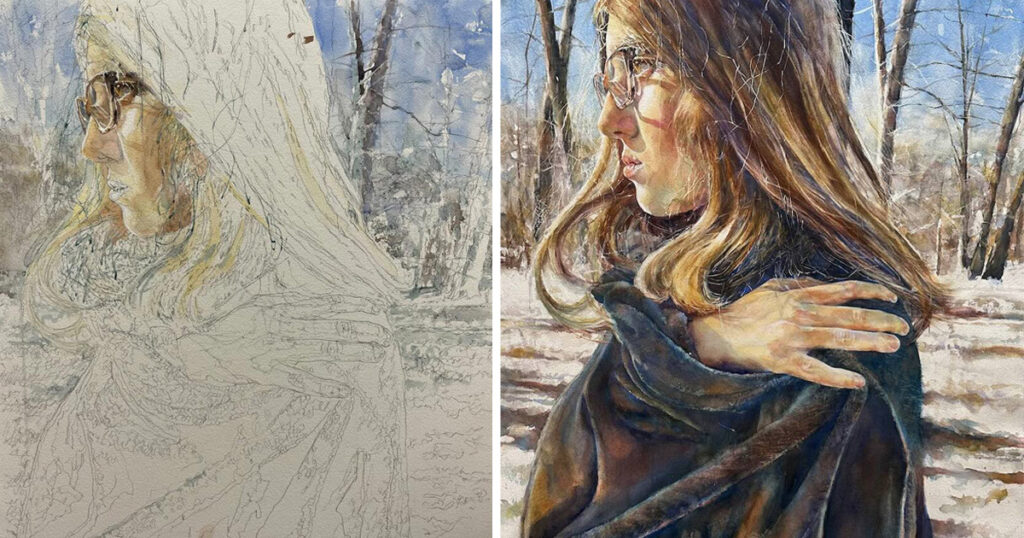
By Jane Jones
Gain an Edge — With Edges
When speaking of a painting, the term edges can refer to two things. One is the relative quickness or slowness of color transition, which is usually described as the hardness or softness of edges. Hard edges can direct attention to an area; soft edges convey shape and dimension in a more subtle fashion, and they attract less attention, so they’re perfect outside the focal area. Edges can also refer to the thickness of objects, such as the thickness of paper, a leaf or drapery fabric. Everything, no matter how thin, has thickness, and with the right illumination, well-painted edges can add accuracy and life to your work.

1. Setup
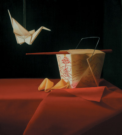
Here’s a photo of the setup I used to create my painting. Notice that the light illuminates the origami bird and paper container so that the thickness of the papers shows. The illumination also reveals soft yet easy-to-see drapery folds and movements.
2. Block-In Edges
Right from the start, I paid attention to where my hard and soft edges would be. If you look closely, you can see that the background wall directly behind the bird and box (A) is darker than the wall on the right along the side of the box (B). I softened the transition between the two background areas (C) because I wanted the entire background to be subordinate to the foreground areas of the painting. The edge between these two areas was already soft because the two values are so close.

I blocked in the areas of the bird and box with a flat layer of titanium white because I didn’t want the dark background color to interfere with their whiteness. Since these objects are separate from the background, I gave them hard edges (D). Then I blocked in the drapery area because I wanted it to be bright red in certain areas and, again, I didn’t want the background color to show through. I softened the edge between the drapery and the background (E) to make those areas recede and become subordinate to the focal areas.
3. Object Edges
You can see that, with all the objects painted, I kept the edges between the bird and the background hard, maintaining the separation between the two. But within the bird are some softer transitions. Notice the shadow of the wing on the neck (F). In the setup photo the edge of that shadow was quite hard, but since the shadow is a part of the neck, I softened the edge just a bit so the light and dark areas appear to be parts of one object (the neck). On the left of the wing’s underside is a dark cast shadow with a very soft transition (G) — but notice that the edge between it and the paper that’s casting it is very hard (H). That’s because the wing and the paper casting the shadow are separate surfaces — even though they’re part of the same object. The paper box also has a variety of edges. Those on the left side and the top are hard where they meet the background (I).

Shadows
By contrast, the right side of the box is in shadow, making its values darker and closer to those of the background. I still made the edge of this area of the box hard (J), but the transition between it and the background is softened by the similarity in values. Within the box are other edges to consider. At the front corner is an edge where the two sides of the box meet (K). Even though these sides are separate surfaces of the box, I softened the transition because the box sides need to appear connected. There’s another transitional edge where the side of the box meets the top flap (L). The crease there is harder, so I painted the transition between the colors harder as well.
Thickness
The box also has edges of varying thickness. If you look at the top flaps, you’ll see that I painted the thickness of those edges (M). I deliberately placed the box within the composition so that those edges would be illuminated. The light also runs along the top thickness of the side of the box and down the diagonal edge (N). See how this edge brings light into an otherwise dark area and adds interest.
Notice that I resisted using my lightest value on this edge; it would have been too light. Also on the dark side of the box is a thicker, rolled or folded, diagonal edge (O), which picked up light, too. Because I wanted this edge to appear rolled, and therefore thicker, I painted a softer transition between it and the side of the box. The drapery has its share of edges, with transitions from light to dark where the drapery rolls and folds (P). The lighting is a bit soft, as are the folds, so most of the transitions are soft. The only hard edges are between sections of drapery, such as where one section is obviously in front of another (Q).
I composed the drapery and light so that the thickness of the drapery would be illuminated (R). This detail didn’t show in the photograph, but I made a note to myself to paint the thickness of those edges. Edge thickness makes the fabric more believable and adds notes of light. The fortune cookies have thick edges (S). Notice how much information they give about the cookies’ folds.

Final Details
To complete the painting Good Fortune, I added the reflection of the drapery onto the box with a glaze of alizarin crimson. I also added a design on the box (using colors from the drapery), the string holding the bird aloft and the wire box handle. By now, you should be able to analyze the edges of these items as well as the chopstick. Ask yourself these questions:
- Which edges are hard? Which are soft?
- Why were the edges painted this way?
- How were the edges painted to show relative hardness or softness?
- Do any of the edges show thickness?
Remember This!
Everything in Good Fortune has edges that give the viewer important and interesting information about dimensionality and the play of light. Edges are such valuable elements! Pay attention to them when you’re composing and lighting your setup — and throughout the process of creating the still life. Those edges can bring your painting to life.
My Palette
All paints are Winsor & Newton oils unless otherwise indicated: titanium white (Gamblin), cadmium yellow, cadmium scarlet, cadmium red, cadmium red deep, alizarin crimson, French ultramarine, phthalo green blue shade (Grumbacher)
- Mixes and Values background: phthalo green + Winsor & Newton Liquin (three layers), then phthalo green + alizarin in the darkest area.
- Origami bird and Chinese food box: cadmium red medium + a green mixture (French ultramarine + cadmium yellow + titanium white)
- Drapery and chopstick: light-value areas: cadmium red; middle-value areas: cadmium red deep; shadows: cadmium red deep + phthalo green blue shade; edges: cadmium scarlet.
- Fortune cookies: titanium white + cadmium yellow + a violet mixture (cadmium red + French ultramarine).
Jane Jones is the author of Classic Still Life Painting (Watson-Guptill, 2004) and a popular workshop teacher. See more of her work and learn about her workshops at www.janejonesartist.com.
You may also like:

Have a technical question?
Contact UsJoin the Conversation!