Painting Composition Tips for Beginners | How To Create Bolder Paintings

Painting Composition Tips for Better, Bolder Paintings
Want to create better paintings? As artist Patti Mollica says, “A strong composition is the foundation of a successful painting.” And whether you’re a beginner or a more experienced artist, knowing how to create a successful composition takes practice and requires mastering a few key techniques.
But don’t worry, artists, Mollica has you covered. Below, she shares essential painting composition tips and techniques — with a few quick and easy mini demos along the way — all pulled from her book, How to Paint, Fast, Loose and Bold. Get ready to enhance your skills and create more successful artworks with these painting composition tips.
Related: Download An Artist’s Guide to Composition for expert tips on creating strong, dynamic design.

Creating a Value Sketch
Creating a preliminary three-value sketch before you start painting will help you see the overall light, middle and dark patterns so you can make decisions about design and composition — the foundation of any painting. It only makes sense to plan ahead before you spend hours, days, weeks or even months working on a painting.
Mass Shapes
Create one or even several value sketches of your subject matter and try to simplify your composition into a few recognizable shapes and values. Be willing to veer away from what you actually see and change shapes, modify values and anything else you deem necessary in the interest of creating order and organization out of visual chaos.
Use Artistic License
Keep your eraser handy because you will try out ideas and change your mind often. This is part of the design process. Remember, you are not working with numbers; you are working with visual information that is being filtered through your personal sense of aesthetics.
What do you think looks good? Does it convey your subject clearly? Will it be readable from a distance when you squint at it? These are all questions you will need to ask yourself.
Color Won’t Save You
Many artists do not plan ahead and just start painting what they see in the hopes that color will save the day. I do not recommend this. In fact, there is a popular saying, “Color gets all the credit, but value does all the work.”
If you work out your composition as you paint, making changes and revisions with hues, values, shapes and placement, your colors will become overworked and muddy.
Muddy colors are the result of changing your mind so many times that the colors all start to blend into gray-brown. Having a game plan for value organization is not only the key to strong compositions, it’s also one of the keys to cleaner colors.

Follow Your Plan
When you have completed one or more sketches, decide which composition you like best and move forward with the painting. Keep your value sketch in plain view while painting so you can refer to it and ensure you are following your plan and sticking with the decisions you made earlier.
When mixing your colors, make certain they correspond to your value plan. Having a value “map” in front of you will allow you to loosen up and paint with more confidence because you will have laid the groundwork for a strong foundation upon which the painting will rest.
It does take some time and effort to compose these value sketches, depending on how complex your scene is, but if you can’t simplify the composition in black and white, it will be far more difficult to do it in color.
A value sketch should not be large or overly time-consuming. Fifteen minutes for a 4- by 5-inch sketch is all you need. Don’t make the mistake of doing a large, elaborate rendering. That defeats the point of learning to simplify. A quick visual guideline is all that is necessary to keep you on track. Keep it simple!

Composing Your Composition
Consider the following basic guidelines to strengthen your design and overall composition.
Dominant Values
Make an effort to design your value sketch (and thus painting composition) so that one of your values will take up most of the picture area. The boldest compositions have a dominant value. Try to avoid having equal amounts of each value in your composition.
Decide on a Dominant Value
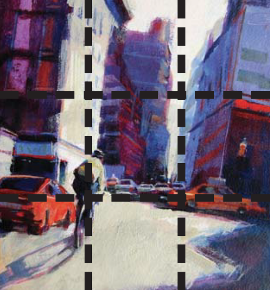
In Blue Building on Tenth Ave., there is a dominance of middle value and dark value, with very little light value. The large light shape of the awning hemmed in by dark shapes above and below leads the eye to the figures.

The strong directional lines of the windows also lead the eye downward. The large middle value shape of the road frames in and provides a contrast for the light-value streak of sidewalk, again bringing the eye to the figures.
Focal Point
Decide where you want the viewer’s eye to land — that will be the primary area of interest in the painting known as the focal point. A properly designed composition will lead the viewer’s eye right to it.
Although this is more relevant in landscapes than still life paintings, your focal point should be supported by your design and the value patterns that lead up to it. Elements of color, value and directional shapes should be employed and emphasized so that there is a pathway leading around your painting to the focal point.
The eye will automatically be attracted to the area of the painting where the lightest and darkest values are in closest proximity to each other. If the values are scattered and don’t offer any type of path toward the focal point, the viewer won’t know where to engage with the painting.

Lead the Viewer’s Eye
Notice how the perspective lines of the fruit, flowers and sidewalk in Flower Dude (above) lead the eye directly to the figure, which is the lightest value surrounded by the darkest value. The viewer’s eye is immediately drawn to the strongest areas of contrast in the painting. Use this strategy when establishing your focal point.
Related: Download An Artist’s Guide to Composition for a step-by-step demo on choosing a focal point.
Cropping

Many beginner painters make the common mistake of positioning the entire subject smack in the middle of the canvas, floating in space.

Cropping some elements slightly off the picture area is much more interesting and creates more variety in the negative space.
Try Variations
Note how the top of the orange and the cast shadow get cropped off the picture area in the sketch below. This is more compelling than having every element centered within the picture boundary.
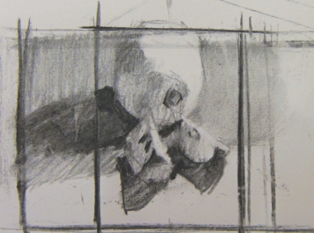
Try cropping your sketch so that the space around your subject (i.e., negative space) has interesting and unequal-sized shapes. Decide in your sketch how to crop your subject to see where it should be positioned on the canvas.

My initial idea was to position the orange and slices on a horizontal format. But after looking at my sketch, I decided it might be more interesting in a vertical format. Try different variations; change your mind. Just be sure you do it all before you start painting!
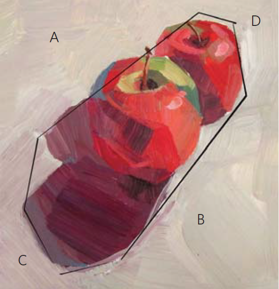
Good Crop vs. Bad Crop
With a square formatting (below) the space around the apples is equal. A = B and C = D.
In the next example (below), the shapes are unequal and therefore more interesting.
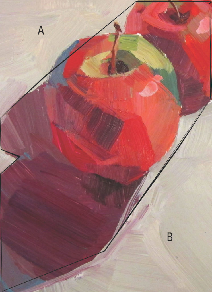
Also notice that although the apple sits in the exact middle of the canvas, the cast shadow and the background apple are cropped so that they go beyond the borders. This diagonal movement offsets the static quality of an object placed in the middle of the canvas.

Rule of Thirds
The Rule of Thirds states that an image is most pleasing when the subject or focal point is placed along an intersection of imaginary lines that divide the image into thirds — both vertically and horizontally.
Horizon and Focal Point Placement is Key
Try to avoid splitting the composition of your painting in half, vertically or horizontally. It is more interesting to place your horizon line either high or low on the canvas. Your focal point is best positioned anywhere but directly in the middle of the canvas.

Overlapping Objects
When composing your setup, try overlapping some elements to create a more dynamic sense of space and better relationships between the elements.

When objects are placed evenly apart with no overlapping, the resulting composition can be boring and flat.

Variety
The eye loves variety. It is intrigued by unequal divisions of space and alignment, and differences in shapes, edges, textures, directional lines and size.
Try to create compositions that are dynamic by the conscious inclusion and arrangement of pictorial elements that play off each other. Here are a few suggestions:
- Make the divisions of space around and between objects unequal and uneven.
- Avoid aligning objects on a horizontal or vertical axis.
- Include a variety of shapes, sizes and proportions in your painting. If the composition feels overly geometric, consider adding or emphasizing an organic shape for visual contrast. Alternate your brushwork edges. Contrast hard, sharp edges near the focal point with soft, feathery edges in the subordinate areas.
- Enhance smooth or solid color passages with busy, tactile areas.
- Contrast a dominant horizontal composition such as a flat landscape with strong vertical or diagonal elements like a telephone pole or tree.

Chickadeaux by Patti Mollica, acrylic on panel, 8 x 8; collection of Susan Martin
Keep Practicing
By practicing these painting composition tips and techniques, you will be well on your way to creating better and bolder paintings. Be sure to check out other simple painting techniques from Patti Mollica in her three video downloads and discover how to achieve a powerful composition, every time you paint.


Join the Conversation!