Don’t Miss These 6 Ready-to-Use Color Palettes
These foolproof color triads enable you to achieve successful paintings without the hassle of color palette trial and error.

Color mishaps in paintings usually stem from using too many colors or combining paints that don’t work well together. Alleviate both of these issues in one quick and simple fix: a compatible color triad.
If three colors don’t give you the results you want, you can add another color that shares their intensity, transparency and tinting strength without presenting a sour note into the color harmony. What’s more, you may even find new combinations that work with the unused colors cluttering your paint box.
1: Delicate High-Key Palette

Delicate tinting colors—aureolin, cobalt blue and rose madder genuine—make an exquisite high-key triad, limited in contrast and beautifully transparent. In watercolor, the colors are nonstaining, easily lifted, and extremely useful as glazes. Although they’re pure, bright colors, they all have relatively weak tinting strength.
Flowers are delightful subjects for the delicate high-key palette, but there are other options, too. How about a misty river scene or a soft portrait? Light-filled landscapes also are successful with these colors, but you can’t make strong darks with them. Powerful darks would destroy the delicacy and subtlety of this palette. Used carefully and sparingly, burnt sienna is a good addition to the palette, because it enables you to increase your range of darks slightly.

This portrait of my granddaughter illustrates the harmony of the delicate high-key palette. I splashed in the spontaneous background and layered well-diluted colors to model her features and the shadows, then added details. Soft edges and delicate colors represent the innocence of childhood.
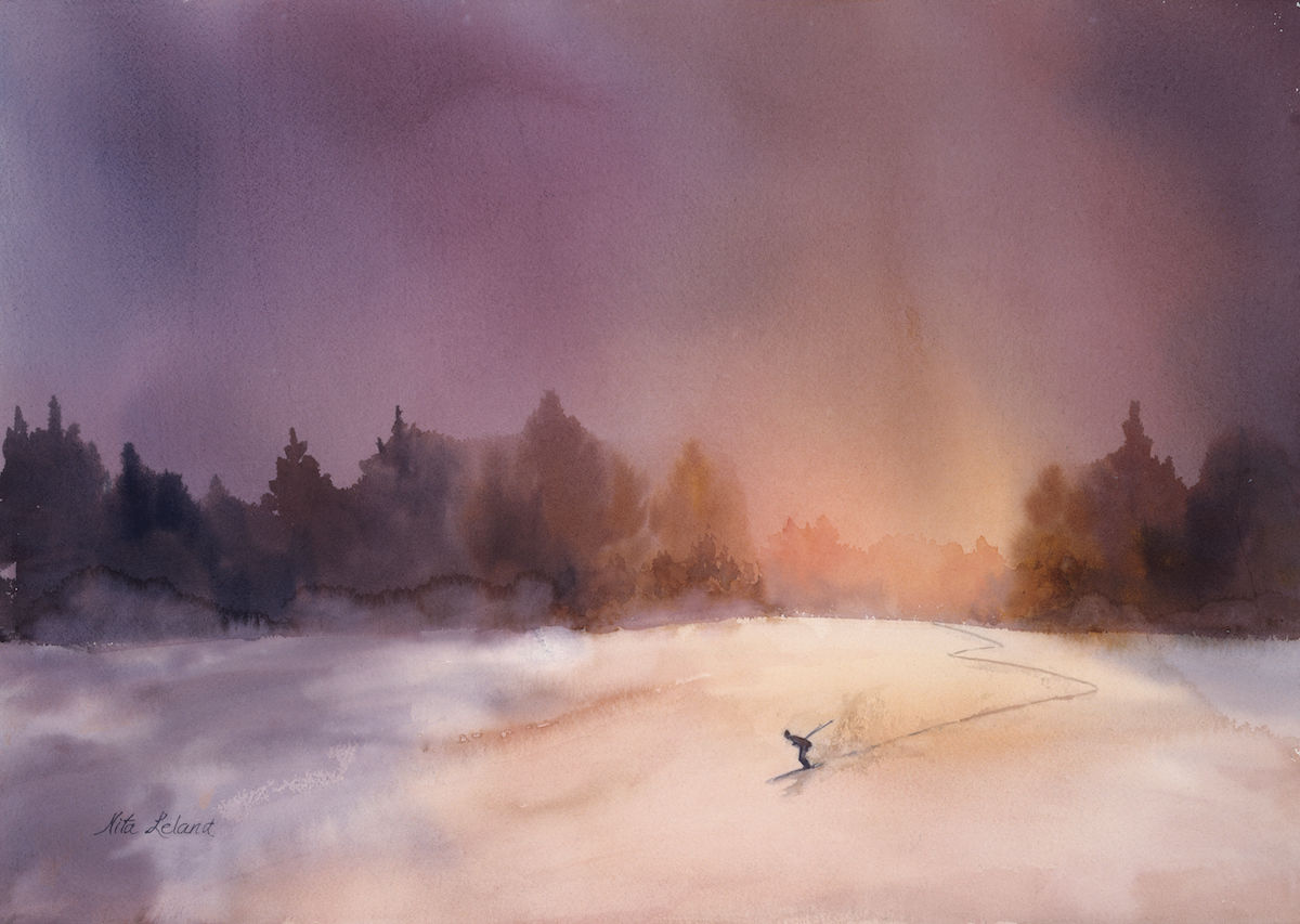
2: Bold Palette

Transparent, high-intensity colors of great tinting strength — such as Winsor lemon, phthalo blue (red shade) and pyrrole red — make a versatile triad. This daring palette can range from dramatic, bold statements featuring rich, intense darks to sensitive, elegant images using delicate tints. The value range runs the gamut from the lightest light to the darkest dark.
These dynamic colors generate energy, brilliance and sharp contrast in any subject, including cityscapes, landscapes, portraits and flowers. Non-objective or abstract compositions can be dazzling with this intense triad. The transparency of these colors makes them useful as glazes when well diluted, but their staining property merits a word of caution: They can’t be lifted easily once they’re dry.
Free Spirit features an intense palette of Winsor red (pyrrole red), Winsor lemon, and Winsor blue (phthalo blue, red shade). It makes rich, low-intensity washes surrounding the glow of the last light of day as it reflects off snow. Does light ever look like this? Maybe not, but the colors express the time of day just as I imagine it. You can take liberties with color if you make your point.
3: Traditional Palette

The traditional palette is a combination of high-intensity, transparent, and opaque colors with intermediate to strong intensity strength. Its workhorse colors are found on almost every artist’s palette: new gamboge, French ultramarine, and cadmium red. New gamboge lends some transparency to the mixtures. French ultramarine is semitransparent. Cadmium red is very opaque.
Many artists think of this palette as muddy, but it features a wide range of values. This is an ideal palette for natural subjects: the olive greens of trees and grasses; the subtle violets of shadows; beautiful browns; and earthy yellows. You can dilute mixtures for high-key paintings, but they lack the subtlety of a high-key palette. Even with its limitations, this is a very useful palette, particularly if you supplement the traditional triad with other colors, such as permanent alizarin crimson, to improve its transparency in mixtures.

4: Old Masters’ Palette

The early masters were limited in their color choices and used colors much like the ones in this palette: raw sienna, Payne’s gray and burnt sienna. This palette of values and intermediate tinting strength yields low-intensity, semitransparent mixtures. It’s surprising how many artists fall in love with the Old Masters’ palette when they try it. Its subtlety is sublimely moving and highly effective.
Any genre works well, but the colors are particularly well-suited for portraits, autumn florals and landscapes. With burnt sienna and Payne’s gray substituting for red and blue, violet mixtures don’t exist. Instead, a good dark takes its place. The greens and oranges are low key and mysterious. This is the only time I recommend using Payne’s gray on your palette as a color in its own right and not as a quick fix for adding darks to a painting.

The unity inherent in harmonious colors is evident in this painting by Carla O’Connor, which reflects the low-intensity color impression of the Old Masters’ palette. O’Connor’s colors set a pensive mood that whispers rather than shouts. This is clearly not the place for phthalo green, cadmium orange, or other attention-grabbing colors
5: Opaque Palette

If you’re looking for unique expression, the opaque palette is a sure way to get it—but it’s tricky. The mixtures are subtle and distinctive. Colors for this wheel are yellow ochre, cerulean blue and Indian red. While cerulean blue seems a bit bright for a low-intensity palette, its density and opacity allow it to fit right in. Indian red has a stronger tinting strength than the other two colors, but they all seem to work well together.
Extreme darks are impossible, but you can get dark enough to have effective value contrast. The limited color range of the mixtures makes it interesting. Work on a wet surface with the colors, laying them in with a big brush and then leave them alone. If you try to move the colors around, you’ll make instant mud and disturb the granulating effects of the colors. Paint rocks, buildings, and landscapes with this palette, and don’t bypass portraits and flowers as intriguing possibilities.

Cerulean blue granulates beautifully on watercolor paper, so I flowed this color onto damp paper with a 3-inch hake brush and rocked the paper gently so the paint would settle in. The opaque palette makes dusky violets and rich, earthy red-oranges, and the low-intensity green mixtures harmonize with all the other colors. I used plenty of water with these colors to ensure that they wouldn’t turn thick and chalky.
6: Bright Earth Palette

This is my personal favorite among the low-intensity triads. The bright earth palette has powerful tinting strength and is beautifully transparent. With this palette, you can achieve extremes of value from bright lights to powerful darks. Using quinacridone gold, indigo and brown madder, you’re forfeiting violet. But if you need it, you can tweak the color in your painting by including a brighter red or blue that will yield a violet mixture.
Color mixtures of the bright earth palette are more transparent and somewhat brighter than those of the Old Masters’, but still rather low in intensity. Paint colors in this palette result in distinctive portraits and abstract landscapes, but it’s effective for almost any subject matter. Keep in mind, because brown madder and indigo are staining colors, you won’t be able to do much correcting with this lively earth palette.

Pirouette features the low-intensity colors of the bright earth palette. Strong tinting strength and the option for good light and dark contrasts are key to this color combination. Although you can mix other colors to make these neutrals, you’ll enjoy the convenience of having them together on your palette for low-intensity paintings.
Create Confident Color
Nita Leland is an artist and instruction who is well-known for her use of color and for elucidating color techniques. She is also known for many books, including Confident Color. Below, she walks you through an approach to using color that makes color selection, color mixing, and color composition easy, fun and uniquely you! To take a deeper dive, get the full Creating Confident Color course. It’s free for members!


Love those color wheels. They definitely will be something that would work for me. Thank yoi
many beautiful possibilities with these new techniques! Thank you very much!
Betty