Why Do Colors Shift on the Canvas? It’s Simultaneous Contrast
Have you ever mixed the “perfect” color on your palette only to apply it to your canvas and find it looks completely different? Or, ever finished working on a section of a painting and it seems to change before your eyes as you move on to the next? You haven’t lost your touch—you are experiencing Simultaneous Contrast. Understanding this principle is the difference between struggling with color and mastering it.
Our minds cannot perceive a color accurately in isolation; we always judge a color based on its surroundings. Simultaneous contrast is the optical phenomenon where the perceived qualities of a color—its hue, value, and temperature—are dramatically altered by the colors around it.
The rule of thumb is simple: Colors placed together appear to lend each other their complementary qualities.
✓
In terms of value, a color will appear darker when placed against a light background, and lighter when placed against a dark one.
✓
Regarding hue, placing complementary colors side-by-side (such as blue next to orange) causes them to mutually intensify, making each appear more vibrant and distinct than they would on their own.
✓
Saturation is affected by the purity of neighboring colors; a color will appear more vivid and intense when surrounded by neutral or dull tones, whereas a color can look washed out if placed next to more highly saturated colors.
The Impact on Your Painting Process
Knowing the effects of simultaneous contrast is helpful, but knowing how to apply it is another issue. These effects are in constant play throughout the painting process. Every color impacts the next, and the color relationships are in constant flux. Although challenging, this is also an opportunity. Here is a simple guide to help manage the effects of simultaneous contrast to maintain control over color in your work
To stop fighting this phenomenon and start using it as a tool, you must first establish a clear plan. Before you mix paint, define the role of every major color in your composition.
✓
The Leading Color This is the color you select to have the strongest, most dominant identity in the composition. It is the “star” of the show.
✓
The Supporting Colors These colors serve to enhance the role and intensity of the leading color. They are not there to compete; they are there to push the Leading Color forward.
Once your hierarchy is set, do not simply paint everything as saturated as possible. Use this 3-step mixing strategy to balance the relationship between your Leading and Supporting colors.

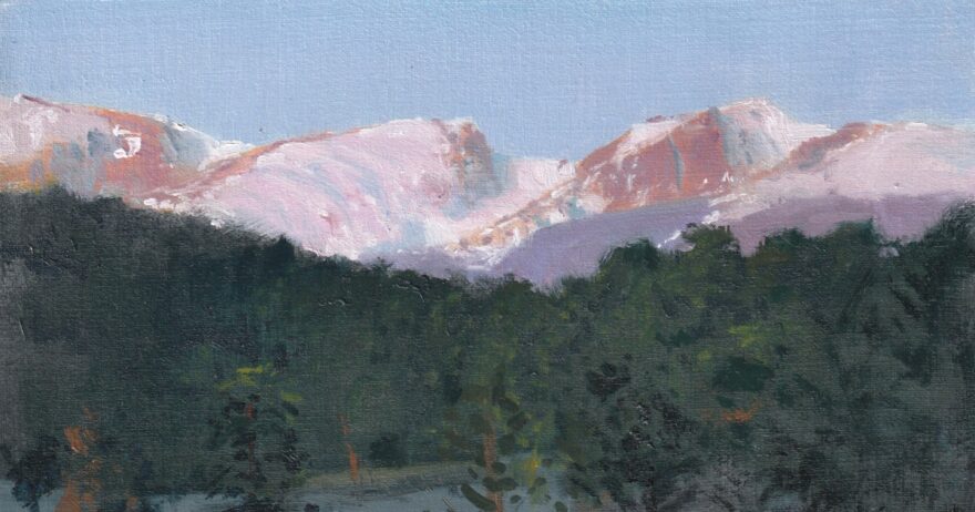
1. Start with Neutrals: Begin by placing a neutral version of your Supporting Color next to the area where your Leading Color will go. This immediately sets the stage to observe the effect of simultaneous contrast. Here, the sky portion contains the dominant colors, painted with a higher saturation. The subordinate areas of the foreground are painted with a neutral, dark value.

2. Adjust the Support: Gradually introduce hue back into that neutral Supporting Color. Watch how it affects the empty space where the Leading Color will sit. Here, the foreground areas are adjusted in response to the colors in the sky.

3. Tune the Leading Color: The Leading Colors are now impacted by the supporting colors in the foreground and can be refined. Continue this careful adjustment until the optical relationship is perfectly balanced.
The Takeaway
Color mixing is a dynamic process. A constant chase for the the right color balance. With a simple strategy and steady approach though, the process can be more enjoyable and satisfying. Rather than fighting against simultaneous contrast, use it to your advantage!

About the Artist
Scott Maier is an artist, instructor, and a content contributor to artistsnetwork.com. He’s an adjunct instructor at Rocky Mountain College of Art and Design, as well as the author of these instructional art books:
See, Think, Draw: An Easy Guide for Realistic Drawing and Beyond.
The Little Book of Oil Painting Secrets (on pre-order)
The Field Guide to Landscape Painting (on pre-order)
From Our Shop


Have a technical question?
Contact UsJoin the Conversation!